

Character Colour Design
This page will contain the colour sheets for all the characters once they have got through the rigors of the design phase.
All art is drawn originally by Rukifellth on paper then scanned and put up so I can break them down into there goods and bads, likes and dislikes.
Some of the drawings may apear rough and some are already coloured, so I take ones im happy with from the design phase and digitally remaster them in Flash, this makes them apear much more cartoon like, it is also many times easier to get the characters colour scheme right if it wasnt to my liking in the original.
The characters wont seem to apear in any order at first, because I may be happy with certain characters before others, but I will imput the images in the order of:
Gunstar Forces
Empire Forces
Golden Silver Forces
So be careful to check all the areas of the page because the newest images wont always be placed at the bottom.
also each character will have 5 diferent coloured designs…when you leave your comment leave the name of the character and the number of the colour scheme you liked best, so for example:
Joe Bloggs says:
RamosesBug Original, Ruks Test3, etc etc..
If you need to see them more clearly just click on the images to enlarge them.
=-=-=-=-=-=-=-=-=-=-=-=-=-=-=-=-=-=-=-=-=-=-=-=-=-=-=-=-=-=-=-=-=-=-=-=-=-=-=-=-=-=-=-=-=-=-=-=-=-=-=-=-=-=-=-=-=-=-=-=-=-=-=-=-=-=-=-=-=-=-=-=-=-=-=-=-=-=-=-=-=-=-=-=-
Gunstar Forces
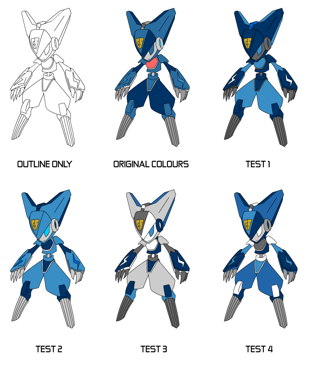
Blue (Klein)
Remastered and coloured – by Stedman75

TEST1: this first test detailed only a minor change from how Rukifellth designed his colours originaly, the change of his pants to white with blue trim makes him feel much more complete to me
TEST2: my brother did this one because I asked him to, so I could see how another person would do it. He gave him a slight tan and used no white (much to my anoyance), he used grey perhaps where he thought the white should have been
————- ————-
Red (Carmine)
Remastered and Coloured – by Stedman75

info soon
yellow soon
————- ————-
Decimarine (Dmarine)
Remastered and Coloured – by Stedman75

=-=-=-=-=-=-=-=-=-=-=-=-=-=-=-=-=-=-=-=-=-=-=-=-=-=-=-=-=-=-=-=-=-=-=-=-=-=-=-=-=-=-=-=-=-=-=-=-=-=-=-=-=-=-=-=-=-=-=-=-=-=-=-=-=-=-=-=-=-=-=-=-=-=-=-=-=-=-=-=-=-=-=-=-
Empire Forces
Ramoses Bug
Remastered and coloured – by Stedman75

These are just a few of the “possible” colours for Bug…. i feel ive been neglecting my GHR work as of late so im gonna try and get back on it…sorry for my absence
Standard Outline: This is just the plain outline exactly as i had traced it in flash over the original picture
Original Colours: This picture displays Bugs orignal colours Rukifelth decided on as close as I could get them without changing the way he looks… The colours are not as intense as in Rukifellths original coloured drawing and have been drained slightly to give him a softer more cartoon approach.
The rest are simply tests just to explore other posibilities….
TEST 1: Different look on him, I tried him in a royal blue overcoat this time with red trim and red eyes, it makes him look lots more important, formal and serious.
TEST 2: Trying to keeping the same look on him but still change it slightly, i thought of Irish leprichorns this time giving him deeper greens and lining him with “lots’o’gold” is eyes are deep forest green.
TEST 3: Going off the rails a bit, I used my flagship colour set, the colours of the Shadowmist, including many deep grays (not black) and varying intensities of green… as Bug has no headband the Kspirit insignia on his chest displays his allegance to the shadows… Bug uses portals for his attacks so his wand contains a Kspirit that creates portals at his will (small portal shown on his wand)… All shadowmist empowered by Kspirits have glowing green eyes.
TEST 4: Giving him a more femanine aproach i decided to colour him in varied shades of purple ranging from very dark to very light… only three colours were used on this verisonmaking the mainstay of his body the purple that most would recognise and just adding the lighter and darker touches wherever they were needed, helping not to make him too femanine resulting in a total loss of his character.
=-=-=-=-=-=-=-=-=-=-=-=-=-=-=-=-=-=-=-=-=-=-=-=-=-=-=-=-=-=-=-=-=-=-=-=-=-=-=-=-=-=-=-=-=-=-=-=-=-=-=-=-=-=-=-=-=-=-=-=-=-=-=-=-=-=-=-=-=-=-=-=-=-=-=-=-=-=-=-=-=-=-=-=-
Golden Silver Forces
Ruks
Remastered and coloured – by Stedman75

Ruk represents Force (Picture below)

Original Colours: This picture displays Ruk’s original colour scheme first decided by Rukifelth when he coloured the original. The colours are limited to the ones shown, not including the blue on her legs in the original or the white parts, these colours of amber orange and brown are the closest colours to the Force insignia she represents.
TEST 1: This is the colour scheme I personally would want Ruks to have ingame… no brown and all light colours, the colour is evenly spread, with no one colour dominating or more visble than another, if so i attempted to balance it out with white.
TEST 2: This time my brother wanted to have a go. He tried to take out all the white and only use the colours still trying to keep the balance of light and dark patches, brown is only used minorly for the trims of the skirt belt and cuffs, as no other colour seemed to work he gave her face a light shade of grey.
TEST 3: Test 3 was supposed to be a different take on Test 1. but my brother decided to take over again, after messing around for a while he settled for the colour scheme shown. Using more shades of grey and less of the colours i wanted (-_-)p, he used only minimal brown touches this time and kept the overall look of the character white.
TEST 4: Still sat in my chair my brother decided to have a third go this time using lots of brown with orange and amber kept secondary…he also added an annoying white lines onto Ruk’s head…he prefers this one over the others.
Satoa
Remastered and coloured – by Stedman75

Satoa represents Lightning (shown below)

TEST1: (jacqsiir) i just added the white on his arms for this. thats right, on Test 1 I wanted a more shady version of the original, making his “skin” very dark and keeping the blue parts mostly dark
TEST2: On test 2 I wanted to see what a brighter version of the original and also remove the red
TEST3: (jacqsiir) I did this after having done test 4. Sted’s previous idea was so incredibly dire that it became imperitive for me to continue my ground-breaking work!
Test 4: (jacqsiir) I realised that sted was having massive brain-power malfunctions so I decided to lend a hand! He was wingeing about not having white in any of his previous designs so i came up with this using my vastly superior design skills. ![]()
(stedman75) you diiiikkkk heeaadddddddddd (-_-)p ^_^
Filed under: Uncategorized |

Well to begin, I’d like to admit, I really don’t know what to say and I am just doing what i’m told to D:
It goes without saying I like the original colors of all
though at blue my preference goes out to either test 1 or 2
and with the “empire forces” to 3
Golden’s 2 and 3 are pretty too but it’s original isn’t half bad either
Well, that’s for my useless opinion. ^-^;
Hmm… it’s difficult, many are good. I like the remade colours Stedman made to original Bug colours with a lighter green. Excellent
Test 1 Blue is perfect…
Ruki is difficult… that chest thing on all the GS-minions are supposed to be a core with a slightly light red glowing colour, (like a pulsing heart), so I’d prefer if you kept that colour intact, otherwise her… hair, should be of one type of colour, preferably different tones of orange. I liked Test 2’s body colours, but I liked Test 1’s dress and test 4’s hands…
Satoa is a girl too. T_T
I liked the original colours, altough the lighter blue should be darker…
i think Satoa should be a guy… ive never seem it as a girl ever really… i just cant see it..
because compared to the others who all have there hats and there bows and umberellas Satoa is just totally different
so i think it should be a guy…
also i didnt know that red thing was important… and i would have kept it on Ruks but it was hard to see…plus it wasnt coloured in
Hmm… fine… T_T
soooorryyy maannn…… but you can see my point right
plus most of the cast are girls
my mate Jono was having trouble posting so ive posted for him
Jono Says:
Blue
Test 1 because it looks more pleasing to me than the others. its a simple colour scheme tweak but effective.
Isnt too over complicated.
Ramoses Bug
That ramoses bug fella id use test 3 because its diffrent.
Ruks
Id use Test 4 because the rest of them 1’s overall use more lighter colours where as test 4 looks darker and more different
Satoa
Id use test 4 again because he looks cool and uses a mixture of both light and dark colours
Ruks, looks better and more clean and smooth. 🙂
Well, problem is that I designed Ruks legs to look like as if she wore leg-warmers, so the upper part is supposed to be white…
ok Rukifellth…. i realise i seem to have made looooads of errors on this page already 😦 ….
i wont ask anybody else just yet… until you have layed out the paramiters…
so tell me now….whats what
Well, all I can say is that the chest thing on the GS-minions are supposed to be a core which looks like a heart (I know, I know, silly and childish), so they are supposed to have a light-red glowing colour.
Also, Ruks’s legs are supposed to be like in the original colour, so the lower part is supposed to be like leg-warmers… but what the heck hapened to her neck?! O_O
Otherwise, it’s all good! ^_^
hahaha her neck eh….thats what i was wondering!!
on the pic you drew she doesnt have one…
i thought that was by design O_O
my bro said it doesnt look bad anyway
o_O??? It looks scary… 😦
i will add a neck then before i re-upload the picture ^_^
oh my god…. WordPress is being so ******* ****! |edit| wow language :-O
how am i supposed to work if i cant upload things to it
every time i try to up load a picture…. it does that stupid thing…”cannot find image” when it ONLY JUST ******* uploaded it one second ago…
its gonna have to wait until WORDPRESS can sort its self out
sorry Ruki man
No problems…
Anything I can do?
Or do you got anything you can show me that you have done? 🙂
i will soon hopfully ill have Yellow and Red done…
i wanted to have yellow done yesterday but after being ill and having two other projects on the same scale as this one that ive not started yet with only 7 weeks to go…. sort of took over
anyway
the colour sheets of the other characters unless i say will remain internally chosen by me and you…. because otherwise people who have no clue start to run my game and what its going to look like….
and that is somthing, i dont want…. team mates hmm yes everyone else…no…
but I will have Yellow and Red done like the blue ive got up there too soon…. its just busy right now is all
haha ive still got to be brave and pick up a pencil again so i can draw the Gunstar base 😦 gonna be HARRRRD
i like the second one you drew, but i think thats gonna be the empire base….howeverthe empire base is as you know now a large hangar for there spaceship (whats it called :S)
what i though of is. the small amount of the empire empire base that is above the ground is actually the bridge to the spaceship protected by a wall and turrets… so it will look quite similar to your base design 2 but the middle is the spaceship…(of course the gunstars dont know this)
however this idea causes many problems that i must iron out if i want to keep it….but, it is just an idea
Anything now?
sorry man… ive got this other project to do too…and its relativley the same size…and ive only just started that one…. ive still been trying to do this one too however…but progress is slow as a result.. -_-
woaa~ redd
oit raksasa(monster)! have something new??
so how it is going?
its not moved much to be honest.. it will after i finish in like 2 weeks.